( Technology )
maturalne doładowanie
©
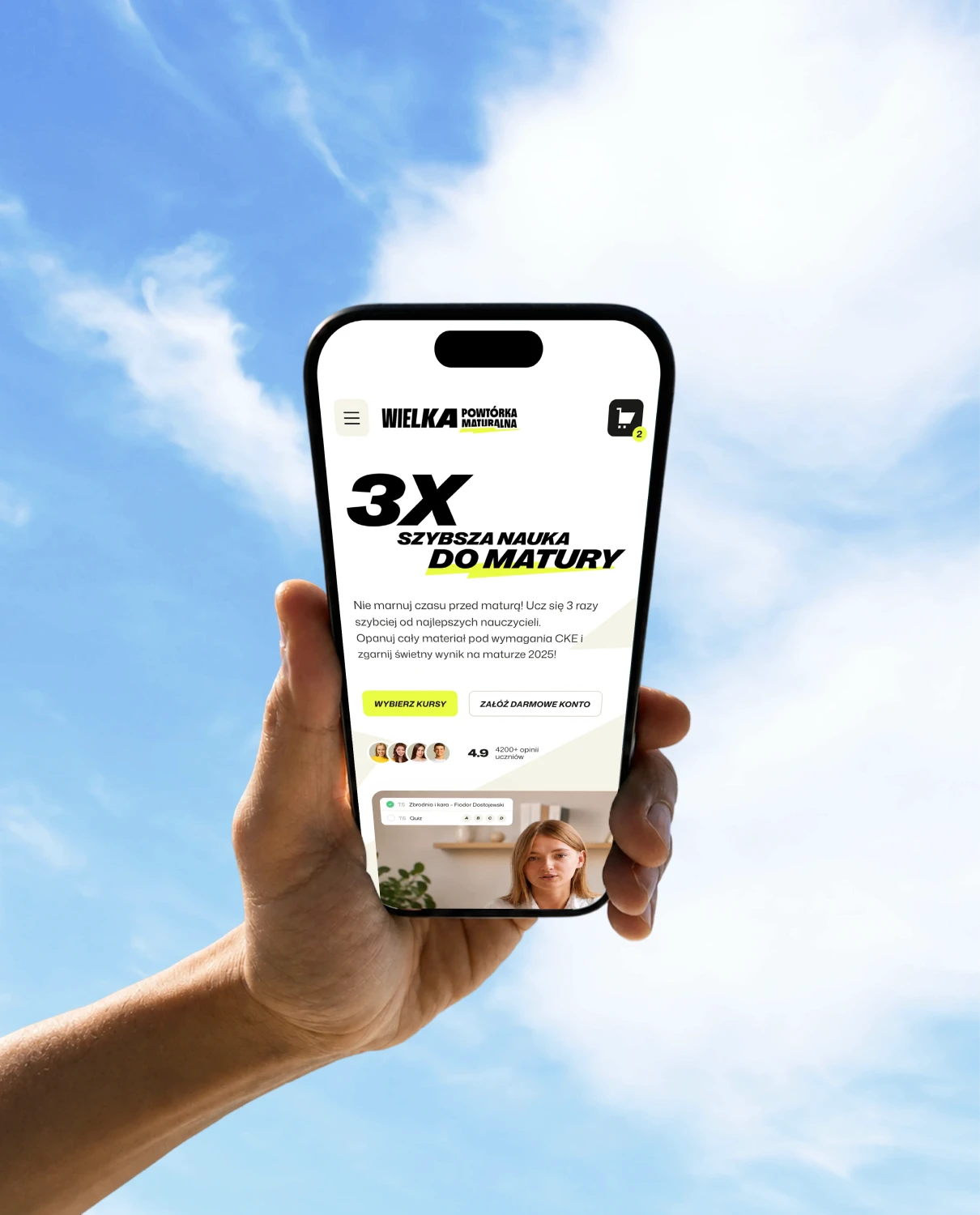
3x szybsza nauka do matury
About the brand
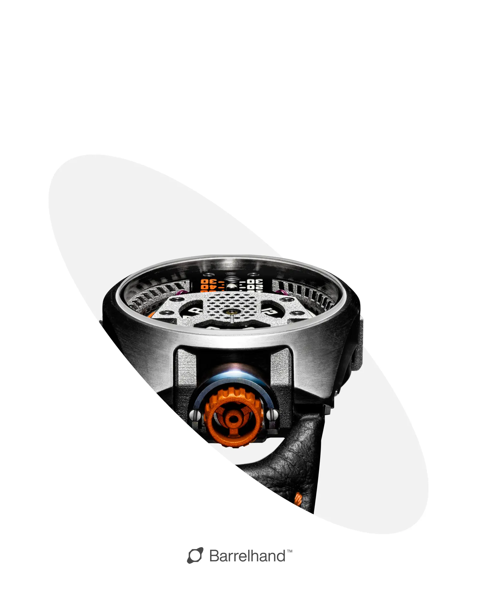
Barrelhand is an independent watch brand from San Francisco that combines precision engineering with top-class craftsmanship. Their products are mechanisms created with a passion for technology, design, and futuristic forms.
One of the components designed by Barrelhand — the “Memory Disc” containing cultural and linguistic data — was placed on the surface of the Moon as part of the IM-1 mission in February 2024.
Bandign goals
The branding of Barrelhand aimed to transform the brand's image — from being perceived as a niche startup to a technology company that redefines what a modern timekeeping tool can be.
The rebranding was intended to highlight the innovative nature of the brand and demonstrate that its development does not stop at aesthetics or craftsmanship, but reaches far beyond Earth — literally and symbolically. The new image reflects progress and advanced engineering, communicating that Barrelhand not only creates watches but also designs solutions with the future of humanity and space exploration in mind. The branding was also based on newly defined values and mission: building technologies that support knowledge, exploration, and the protection of cultural heritage — in line with the brand's message: to create instruments of purpose for humanity’s future, on Earth and beyond.
Credits and scope of work








System wizualny marki
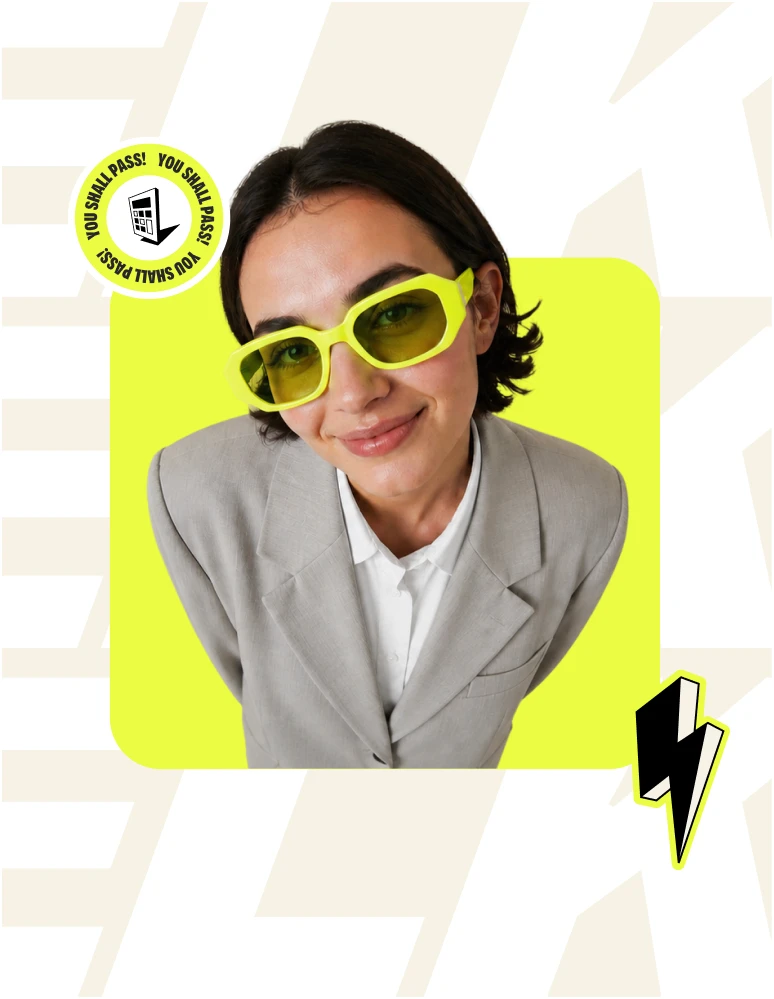
System identyfikacji wizualnej i architektury marki objął submarki, platformę edukacyjną oraz wszystkie punkty styku z użytkownikiem. Fundamentem jest motyw energii symbolizowany przez piorun, dynamiczne kompozycje i brand hero Powtór, który stał się znakiem rozpoznawczym całego ekosystemu.


Komunikacja
System identyfikacji wizualnej i architektury marki objął submarki, platformę edukacyjną oraz wszystkie punkty styku z użytkownikiem. Fundamentem jest motyw energii symbolizowany przez piorun, dynamiczne kompozycje i brand hero Powtór, który stał się znakiem rozpoznawczym całego ekosystemu.
Każdy komponent powstał według tych samych zasad projektowych, więc marka zachowuje spójność niezależnie od kanału. System jest skalowalny: kolejne produkty, kampanie i funkcje można dokładać bez rozmywania charakteru marki.




Brand Hero
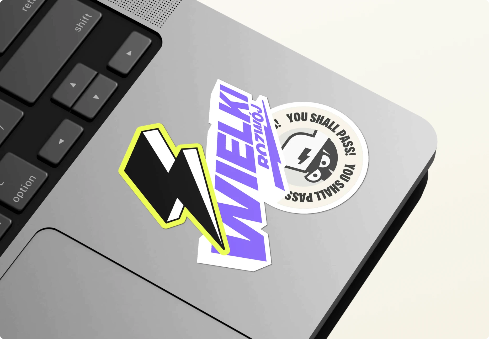
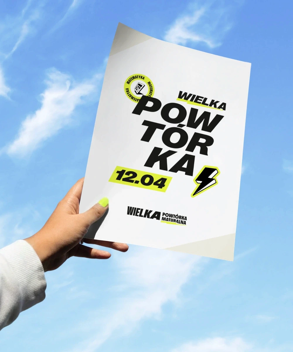
System identyfikacji wizualnej i architektury marki objął submarki, platformę edukacyjną oraz wszystkie punkty styku z użytkownikiem. Fundamentem jest motyw energii symbolizowany przez piorun, dynamiczne kompozycje i brand hero Powtór, który stał się znakiem rozpoznawczym całego ekosystemu.
Każdy komponent powstał według tych samych zasad projektowych, więc marka zachowuje spójność niezależnie od kanału. System jest skalowalny: kolejne produkty, kampanie i funkcje można dokładać bez rozmywania charakteru marki.

System przedmiotów
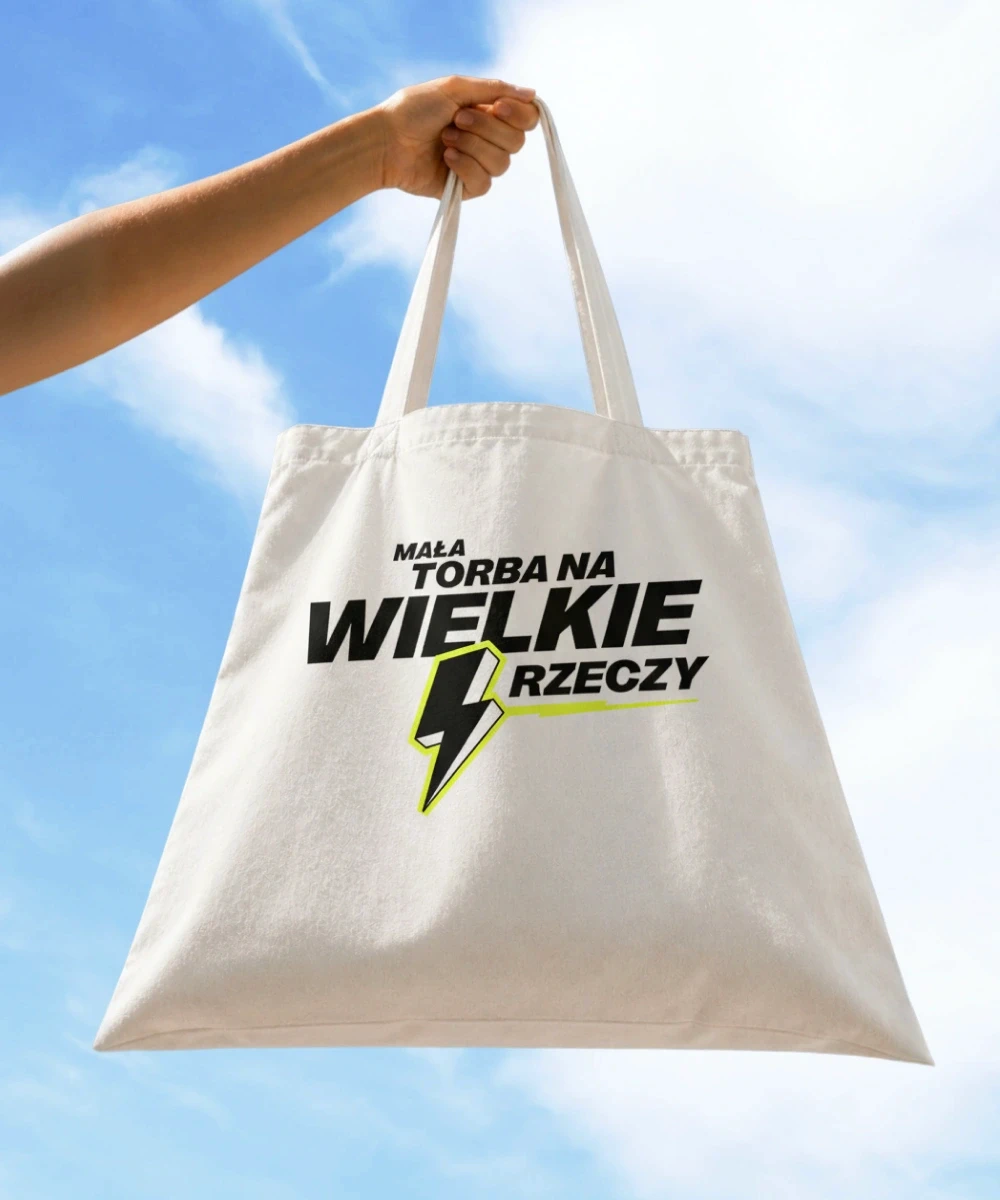
System identyfikacji wizualnej i architektury marki objął submarki, platformę edukacyjną oraz wszystkie punkty styku z użytkownikiem. Fundamentem jest motyw energii symbolizowany przez piorun, dynamiczne kompozycje i brand hero Powtór, który stał się znakiem rozpoznawczym całego ekosystemu.
Każdy komponent powstał według tych samych zasad projektowych, więc marka zachowuje spójność niezależnie od kanału. System jest skalowalny: kolejne produkty, kampanie i funkcje można dokładać bez rozmywania charakteru marki.
Paski
Projekt strony
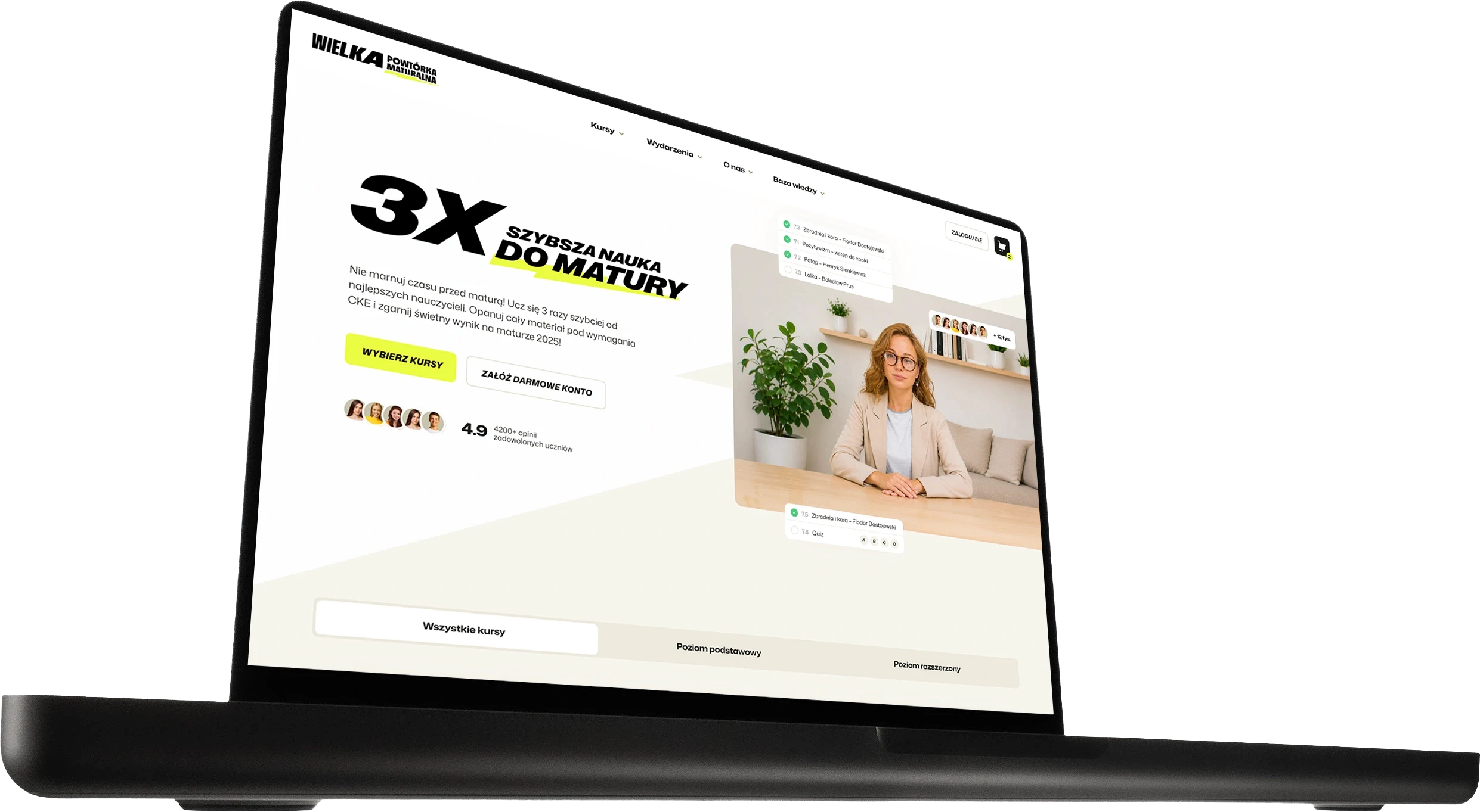
System identyfikacji wizualnej i architektury marki objął submarki, platformę edukacyjną oraz wszystkie punkty styku z użytkownikiem. Fundamentem jest motyw energii symbolizowany przez piorun, dynamiczne kompozycje i brand hero Powtór, który stał się znakiem rozpoznawczym całego ekosystemu.
Każdy komponent powstał według tych samych zasad projektowych, więc marka zachowuje spójność niezależnie od kanału. System jest skalowalny: kolejne produkty, kampanie i funkcje można dokładać bez rozmywania charakteru marki.



Rezultaty
Nowe logo pozwoliło wyraźnie wyróżnić markę na tle konkurencji i stworzyć nowoczesny język wizualny bliższy młodym odbiorcom. Dynamiczna identyfikacja zwiększyła rozpoznawalność marki oraz pomogła budować bardziej spójny i profesjonalny wizerunek w komunikacji online i offline. Logo stało się charakterystycznym elementem ekosystemu marki i poprawiło odbiór materiałów edukacyjnych, zajęć stacjonarnych oraz działań marketingowych. Projekt przyczynił się również do wzrostu zaufania do marki oraz stworzenia bardziej angażującego doświadczenia wizualnego dla uczniów przygotowujących się do egzaminów.
Paski


Rezultaty
Nowe logo pozwoliło wyraźnie wyróżnić markę na tle konkurencji i stworzyć nowoczesny język wizualny bliższy młodym odbiorcom. Dynamiczna identyfikacja zwiększyła rozpoznawalność marki oraz pomogła budować bardziej spójny i profesjonalny wizerunek w komunikacji online i offline. Logo stało się charakterystycznym elementem ekosystemu marki i poprawiło odbiór materiałów edukacyjnych, zajęć stacjonarnych oraz działań marketingowych. Projekt przyczynił się również do wzrostu zaufania do marki oraz stworzenia bardziej angażującego doświadczenia wizualnego dla uczniów przygotowujących się do egzaminów.