strategic brand transformation of Symbol Studio
Rebranding. Strategic brand transformation.
We are entering a new chapter in our history – we have undergone a complete rebranding to better meet the challenges of the modern market and the needs of our clients.
The new image is not only a visual metamorphosis but, above all, a strategic repositioning of the brand, the task of which is to increase conversion and brand recognition.

Mateusz Pałka
Founder / CEO / Creative director

Why did we decide on rebranding?
Every brand goes through phases of change, adapting to the dynamics of the market and the needs of its audience.
Symbol Studio has reached a point where it was necessary to deeply analyse our branding and market position. We noticed that we lacked a clearly defined identity, effective communication tools, and a precise brand positioning. Most importantly, we did not have a clearly defined perception of our services.
This was a barrier that hindered our effective scaling, consistent communication of value to potential clients, and accurate targeting of our target groups.
New positioning of Symbol Studio.
Repositioning the brand required a conscious analysis of our customers – understanding their needs, concerns, ways of communication, and expectations towards the branding agency. Until now, Symbol has primarily been perceived as a studio specializing in visual identification. Now, we have deliberately transitioned to the role of a strategic partner supporting brands in their digital transformation.
By analyzing the market, we noticed a gap – most branding companies focus on a wide spectrum of clients and projects, but rarely offer a comprehensive approach that combines business consulting, brand strategy, and technology implementation into one cohesive system. This is exactly the niche we intend to fill.
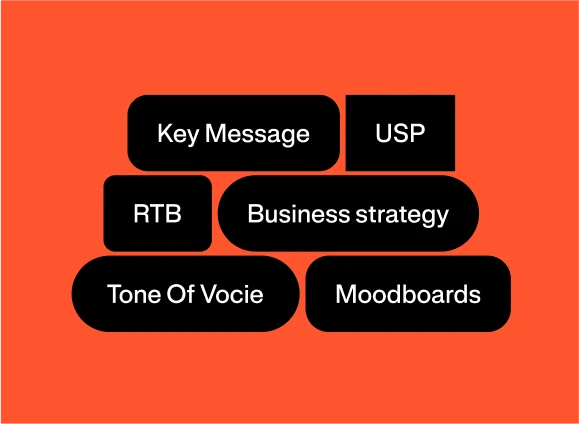
We want the brand strategy to be a coherent element in building the business, image, and communication, which will later be translated 1:1 into the website or social media.
Repositioning the brand required a conscious analysis of our customers – understanding their needs, concerns, ways of communication, and expectations towards the branding agency. Until now, Symbol has primarily been perceived as a studio specializing in visual identification. Now, we have deliberately transitioned to the role of a strategic partner supporting brands in their digital transformation.
By analyzing the market, we noticed a gap – most branding companies focus on a wide spectrum of clients and projects, but rarely offer a comprehensive approach that combines business consulting, brand strategy, and technology implementation into one cohesive system. This is exactly the niche we intend to fill.
We want the brand strategy to be a coherent element in building the business, image, and communication, which will later be translated 1:1 into the website or social media.

Defining competitive advantage.
The new approach of Symbol Studio is distinguished by three key aspects, implemented comprehensively (full in-house):
Understanding business and strategic consulting – Thanks to years of experience, familiarity with hundreds of different businesses, and understanding the mechanisms that occur within them, we possess knowledge that we share and utilize. We analyze the market as well as the target group of a given brand, identify problems, and propose solutions that provide real benefits to clients.
I like how one of our clients presented it - Damian Misiak, CEO of Done Deliveries:
“Symbol has the tendency to ask questions, challenge, and genuinely try to determine what its objective is...”Integration of strategy and image – we create cohesive communication and visual systems that become effective growth tools for our clients. Functionality is our main criterion; we want branding to be a useful tool in the hands of our clients, not just pretty pictures in our portfolio.
Understanding technology and its practical implementation – we utilize modern technologies - from no-code tools to animations, 3D, or AI, to effectively support the digital transformation of our clients' businesses.
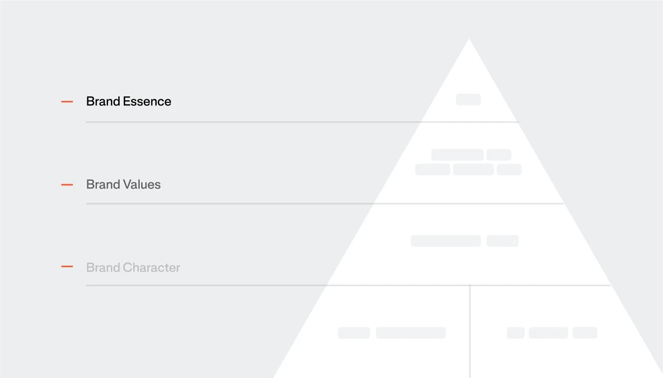
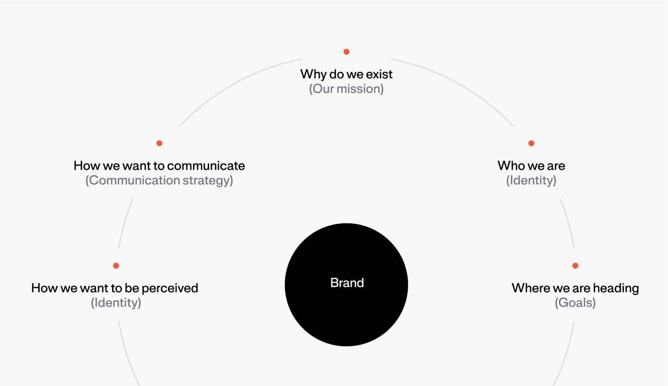
The strategic assumptions of our brand.
Our brand strategy is based on three time axes (this is also a certain interpretation and reference to the internal processes of collaboration with clients):
Past: We draw inspiration from great works and symbols that have shaped the development of culture and technology. This is the foundation on which we build the values of our brand.
Present: We focus on delivering value here and now, building partnership relationships based on trust and real results.
Future: Our mission is long-term and aims to create brands that will become symbols of the future. We want our clients to be perceived as leaders in their industries.
Brand communication. The symbol as a key element.
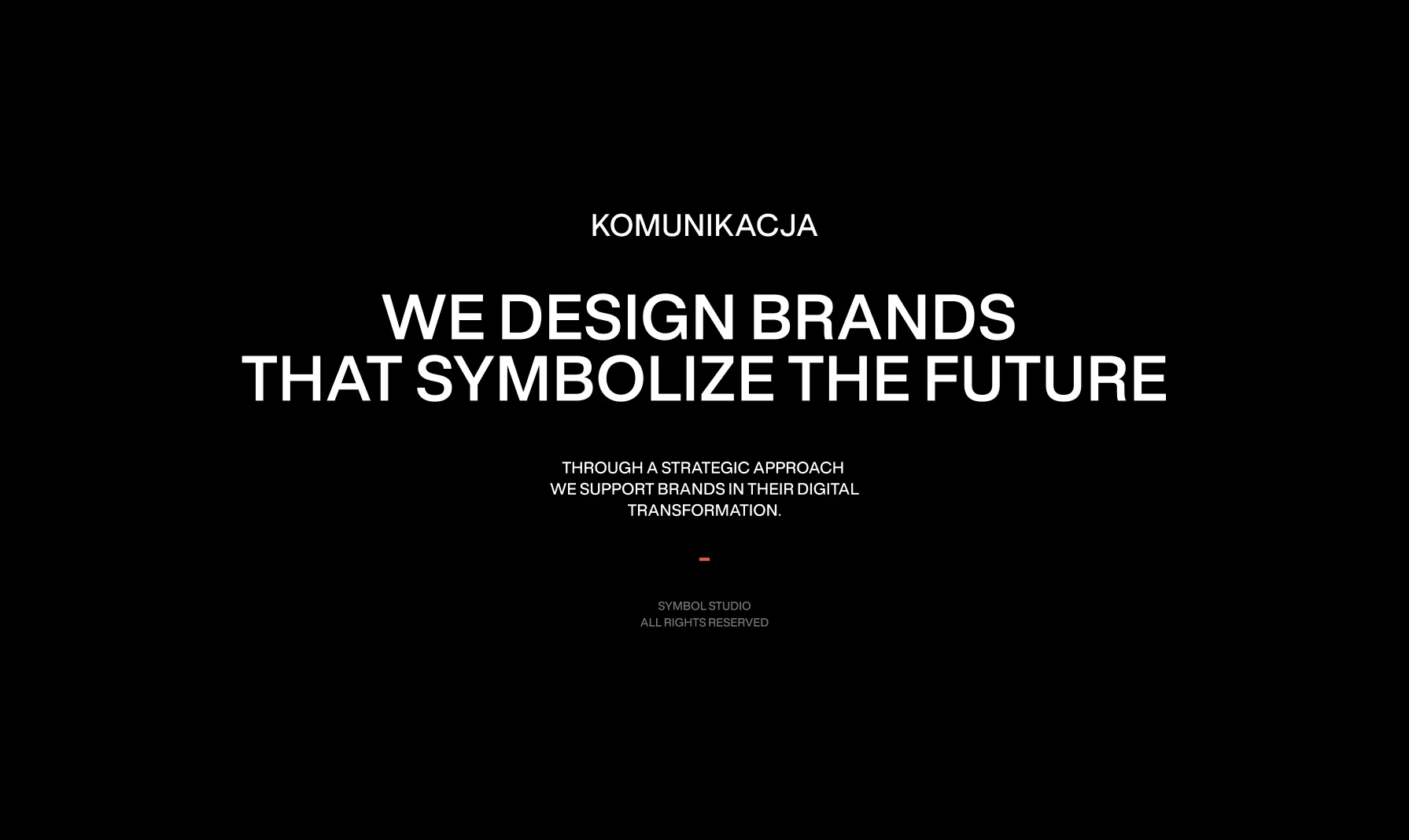
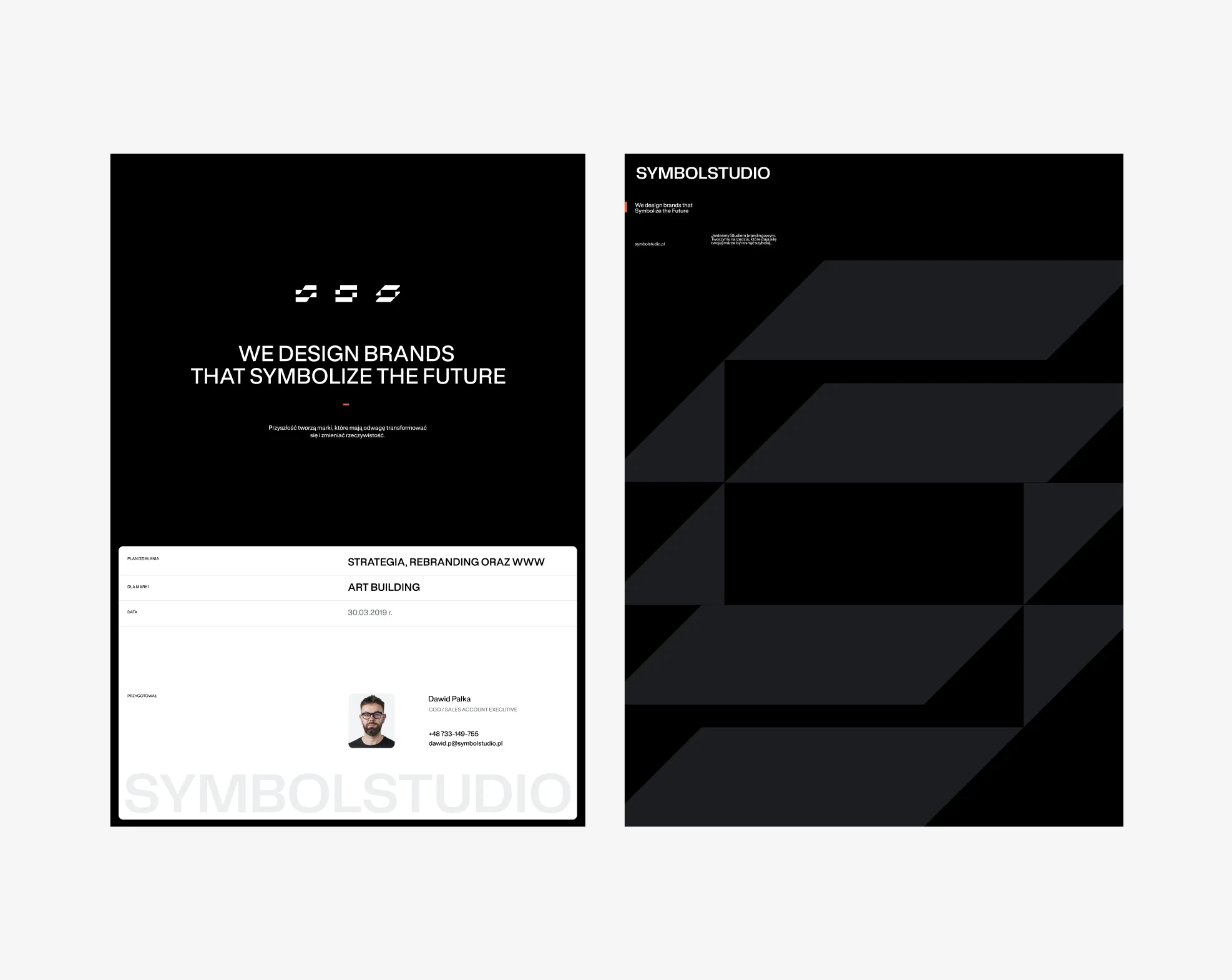
Communication is multifaceted. In the first contact with the brand, we want to present a more "provocative" approach to brand communication, clearly referring to our name, in order to spark interest among the audience. Phrases such as “These symbols define our world” and “We design brands that become symbols of the future” clearly delineate our vision and the value offered to clients.
In the second phase, we based the communication structure on deeper audience engagement. Our services were clearly defined, each preceded by a question about potential losses resulting from inaction in a given area.
Example:
“How many growth opportunities has your brand lost due to the lack of a good plan and advice?”
“How many customers have you lost to your competitors, who adapt and respond more quickly to the changing needs of the market?”
This structure employs storytelling techniques, where conflict and challenge become the starting point for presenting a solution. As a result, clients can easily understand the value of our services and the benefits of collaborating with us.
New image - scalable system.
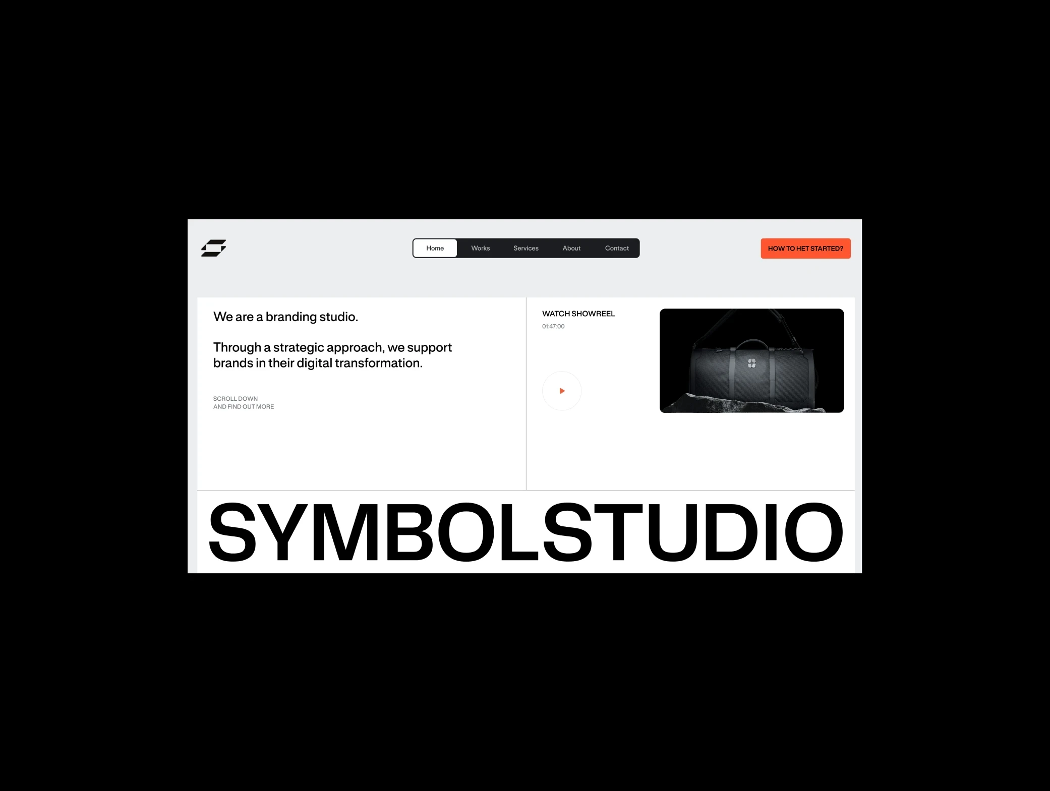
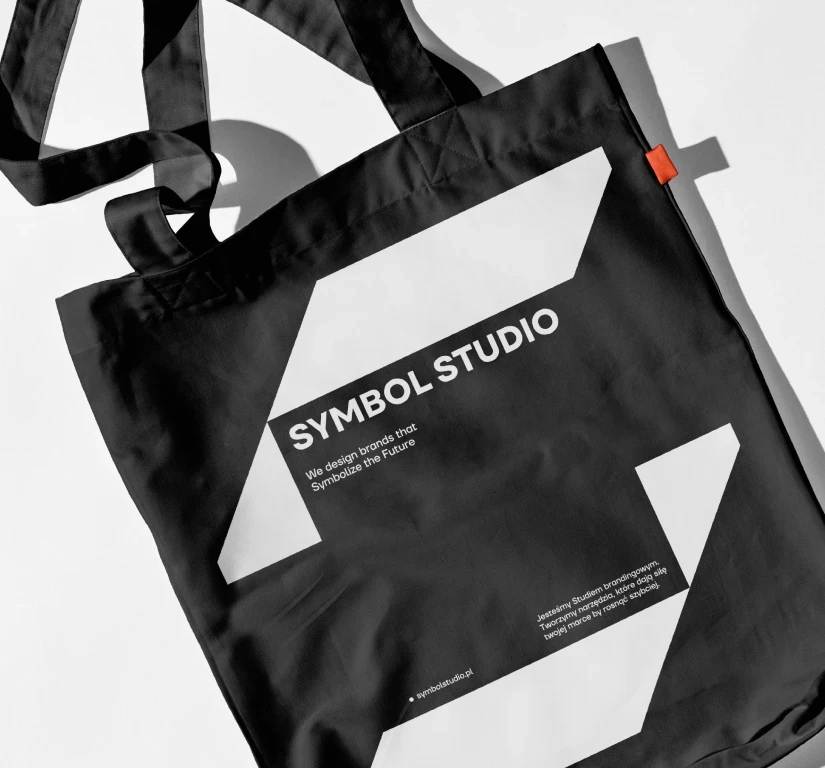
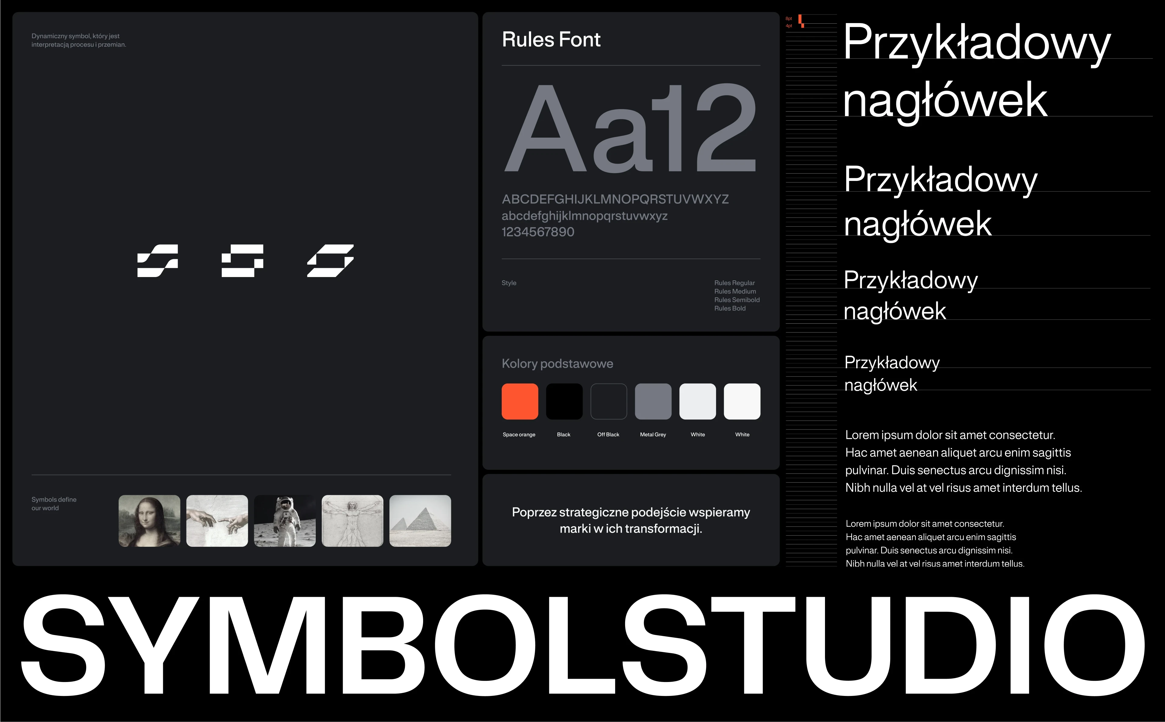
Visually, our brand has undergone a transformation reflecting our internal processes and the technological nature of our work. The new symbol is a reinterpretation of our design process consisting of three main stages. Each stage is evident in the micro-interactions of the signet and in the visual communication of the individual stages of collaboration.
The forms of the signet have also become the foundation for scaling and building the entire system. Each symbol has a different form but remains within the same structural assumptions, which gives us many possibilities for scaling the image and playing with it.
The colour scheme is based on accents of orange, black, off-black, white, and grey, emphasising the technological character of the brand. The entire image is kept in a minimalist aesthetic, where symmetry and balance dominate, ensuring clarity and transparency of communication.
Conclusions from the rebranding.
The key element of the entire process was understanding our competitive advantages and the value we want to deliver to our clients. With a strategic approach, clearly defined communication, and a consistent, minimalist image, our brand has gained a solid foundation to effectively support clients in their digital transformation.
In summary:
Changing the perception of the brand from a contractor to an advisor has positively impacted the quality and depth of collaborations.
The new communication system (storytelling based on questions and consequences) better engages decision-makers.
Our new symbol has become a functional tool – a carrier of ideas, not just a logo.
A coherent branding system has been built that supports client processes and strengthens their positioning.
Clearly communicated competitive advantages (strategy + technology + implementations) helped us stand out in a crowded market.